From effective design elements to optimization tips, here’s what you need to know to create successful landing pages.
Here, you’ll find:
- What defines a landing page
- How to design a landing page for maximum conversions
- Common landing page mistakes to avoid
- Examples of landing pages that boosted ROI
When it comes to paid search, the ad itself is only part of the equation. Once you get that coveted click, there’s more work to be done.
That’s where your landing page comes in.
We talk a lot about landing pages around here because of how make-or-break they can be for your campaigns. Effective landing pages accurately represent your brand, offer something of value to the visitor, and see an impressive conversion rate.
Not-so effective ones, on the other hand, garner little more than a high bounce rate and marketing budget spent on clicks that didn’t convert.
For everything you need to know about landing pages and how they factor into a well-rounded digital marketing strategy, read on.
What is a landing page?
A landing page is a page on your website that’s specially crafted to capture the visitor’s information. People most often arrive on a landing page via clicking through on an ad or an email.
The goal of a company’s landing page is to gather the visitor’s information in exchange for something. This could be anything from an educational piece of content to a discount code.
Landing pages are generally designed with a more targeted audience in mind than the rest of your site. As such, they aren’t meant to be arrived at through your homepage or navigation menu.
While lead generation is the main goal of most landing pages, Mailchimp explains that there are “click-thru landing page” types as well.
The goal of these pages is for visitors to click the call to action (CTA) and be taken to a new page to follow through with the action, whether that’s to place an order, schedule a consultation, or something more.

When designing your landing pages, experience tells us that the most important word to keep in mind is “minimalism.” (Image: Unsplash)
Why are landing pages important in digital marketing?
As HubSpot succinctly puts it, the goal of a landing page is to generate leads for your business. It also serves as a type of quick introduction for those who are just stumbling upon or learning about your company.
With that in mind, you want your first impression to be one that’s positive and properly reflects your overall brand. You can do this with elements such as:
- Eye-catching visuals
- Concise page copy
- Thoughtful page design
- Consistency between the ad leading to the landing page and the page itself
- The offer you’re presenting in exchange for a person’s information
Not only can landing pages help increase conversions, but they can also provide you with valuable information about your target audience.
Pro tip: Heatmapping can also tell you a lot about how your audience interacts with your landing page. This tool shows things like scrolling behavior, where on the page people gravitate to most, and how activity might vary on different devices.
What elements make up an effective landing page?
The most effective landing pages are those that are being regularly tested and optimized. However, there are a few key elements that can help ensure your landing pages are as targeted and effective as possible.
These include:
- A clear goal
- A design consistent with your overall brand aesthetic
- An appealing offer
- A strong CTA
- A lead form
- Verbiage that mirrors and delivers on the ad that brought them there
- A voice and tone that speak directly to your target audience
How do you design a successful landing page?
When designing your landing pages, experience tells us that the most important word to keep in mind is “minimalism.” That’s because, more than anything, you want your page to be free from distractions.
Anything that could divert the visitor’s eye from your CTA will only do your page a disservice.
And, because people are often pressed for time, you don’t want the viewer to have to do a ton of scrolling to complete the desired action. Along with a clean, minimal design, it’s wise to keep things short and to the point.
One easy way to stick to a less-is-more aesthetic is by excluding elements that appear on your regular site pages. Think: your header navigation or subscriber box for your newsletter.
These are great to have on your regular pages, but they can potentially make your landing pages cluttered, depending on what other elements are in play. Instead, you could simply have your logo hyperlinked to your homepage, where visitors can find these page elements if need be.
Each design element should serve to tastefully draw the reader’s eye to your CTA. This includes things like whitespace and thoughtful imagery, such as stock photos, color blocks, or informative charts. (Whitespace doesn’t necessarily mean “white” in color — just free from text, images or graphics.)
What are some common landing page missteps to avoid?
There’s almost always room for improvement when it comes to your landing pages. However, there are a few common landing page mistakes we’ve seen companies make repeatedly.
These include things like:
- Neglecting to test your forms
- Putting too many design elements on one page
- Not optimizing for mobile
- Boring, generic CTAs
- Slow page speed
The good news? Once you know to look for these issues, any that you come across can usually be addressed and fixed quickly.
How do you optimize landing pages for conversions?
Conversions are the goal of most landing pages. Because of this, any optimization tweaks or tests conducted should aim to increase those conversions.
For starters, spend time brainstorming a handful of attention-grabbing headlines that you can then test to see how your audience responds.
From there, make sure your copy highlights the value you can provide your visitor or what problem your product or service can solve, using proof points such as client testimonials or badges if you have them. These elements are often more effective than when a company simply brags about how great they are.
Basically, focus on what value your company can bring to the visitor, not on your company itself.
Other conversion rate optimization (CRO) strategies for landing pages include:
- An easy-to-complete form
- Proof points that illustrate your credibility
- A special offer of some sort
- A mobile-friendly experience
- Social share buttons
- A plan for consistent element testing and analysis
What are some examples of effective landing pages?
Just like there’s no single path to increase landing page conversions, there’s no one right way to design your landing page.
With that in mind, here are a few landing pages for brands we’ve worked with that not only ended up paying for themselves, but that saw results like more time on site, increased conversions, reduced bounce rate, and more.

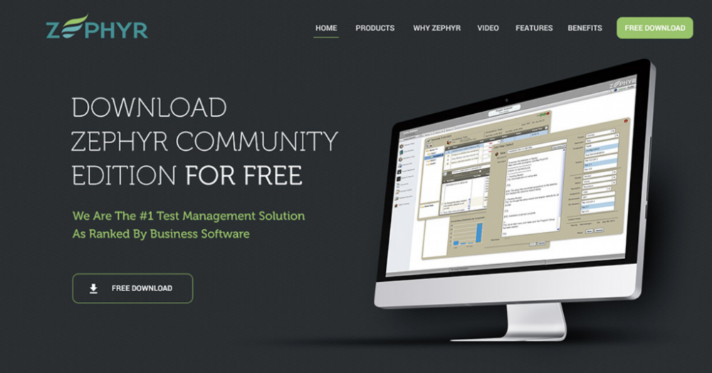
What makes it successful: This landing page for test management software company Zephyr gets down to business. The offer is clear, the design is minimal, and their claims are backed up by impressive proof points.

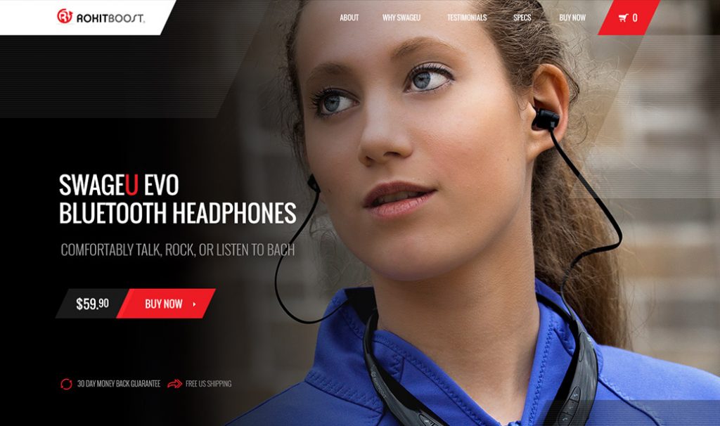
What makes it successful: This landing page for bluetooth headphone brand RokitBoost leans heavily on the visual to show the specific product it’s selling “in action.”
From there, it uses minimalist navigation in case the visitor wants to know more before making the purchase. Otherwise, they can go ahead and add to cart, with the added perks of free shipping and a money-back guarantee.

What makes it successful: Proven’s goal is to help businesses hire better and faster. This page targets restaurants, with a simple design, strong CTA, and thoughtful use of color to draw the eye where it needs to go.
See more examples of successful landing pages and their results here.
The takeaway
Landing pages deserve a prominent place in your digital marketing plan.
They can be a significant value driver for your business, whether you leverage them as part of your pay-per-click (or paid search) campaigns, email marketing, or elsewhere.
When you create well-thought-out landing pages that have the right mix of elements, a clear message, and an easy way to complete the desired action, you’re bound to see positive results.
This article has been updated and was originally published in December 2020.

