From reciprocity to skepticism, here’s how to leverage a variety of psychology tricks to improve your landing page performance.
Here, you’ll find:
- Creative ways to make your landing pages more effective
- How psychology tricks can help you craft better pages
- What these psychology methods mean
- How psychology and digital marketing go hand in hand
Being a mind reader would certainly give you a leg up as a professional marketer. (Not to mention how helpful it could be on first dates.)
Sure, you can ask the right questions during calls and meetings, send out surveys, and request feedback. But knowing exactly what your target audience members are thinking is supremely valuable information that’s often hard to come by.
Luckily, psychologists and researchers have spent decades studying patterns in human behavior. These findings can be helpful tools when building or refreshing various parts of your marketing strategy — particularly when it comes to landing pages.
Let’s get into the psychology tricks worth exploring to build better landing pages.
1. Opt for a “give” vs. “take” message
In social psychology, there’s the concept of reciprocity. This basically means that people are looking for a return or benefit that’s equal to or greater than what they’re being asked to give.
That’s why, when it comes to your landing pages, making the visitor feel like they’re getting something in return for submitting their information or taking a certain action can be a big boost for your clickthrough and completion rates.
For example, you can make an offer like “No onboarding fee, save $300” before asking for the person’s information. This way, they know off the bat that they’re getting something in return.

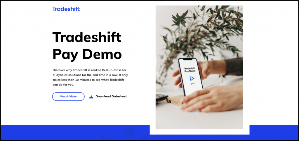
Tradeshift uses a simple design with plenty of whitespace to let the image and CTA take center stage.
2. Leverage a minimalist design
There’s a reason spas use warm, candle-like lighting and soft music while dance clubs flash colorful strobe lights and blast thumping bass beats. Visuals and other sensory elements affect our mood and how we process information.
We’ve touched on the importance of avoiding a distracting landing page design in the past. By getting rid of unnecessary elements, you can keep your pages from looking cluttered. This also gives the viewer’s eye a break so they can fully process the message you’re presenting to them.

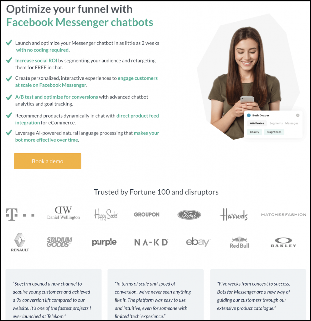
Spectrm’s landing page doesn’t bother tooting its own horn — they let their impressive client roster and client testimonials speak for them.
3. Persuade through social proof
You may have heard the phrase “feelings aren’t facts.” It’s a common refrain from therapists and other psychology professionals. It’s also good to keep in mind when you’re crafting messaging for your landing pages.
Rather than relying on flowery terms or self-promotional language, see how you can let the facts speak for your brand instead. Leveraging things like client testimonials and data around results or success rates are great ways to show your target audience you’re the right fit for them, rather than simply telling them yourself.
4. Consider a limited-time offer
Ah yes, the “fear of missing out,” or FOMO. In psychology, this is sometimes referred to as the “scarcity” factor. As the Online Marketing Institute explains, this psych tactic works because humans often value things more “when we know we can’t have them anytime we want.”
This can also be classified as loss aversion. Companies can use the idea of scarcity on landing pages in a number of ways, including:
- Embedding a countdown clock for when a coupon or offer expires
- Mentioning that an offer is only available for 24 hours
- Adding an end date for when a code or coupon will no longer be valid
Pro tip: The psychology trick of loss aversion can also work for remarketing. Consider leveraging this tactic when you’re trying to sweeten the deal and get a page bouncer or cart abandoner to complete an action they started.

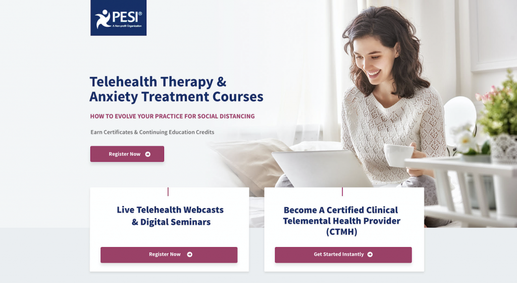
PESI’s landing page uses the deictic gaze theory to draw the visitor’s eye to the CTA.
5. Use visuals as guides
An effective landing page can also use visuals to subtly (or not-so subtly) guide the viewer’s eye towards the call to action (CTA).
As Instapage points out, this is part of the deictic gaze theory. The theory claims that our eyes naturally follow cues like arrows or wherever someone else is looking. If you want to experiment with a design that creatively draws attention to your CTA button or form, this is a tactic worth trying.
6. Avoid sensationalized language
According to the American Psychological Association’s dictionary of psychology, the concept of skepticism is “the position that certainty in knowledge can never be achieved.”
It’s also a good reminder that, the more overblown and sensationalist your landing page copy is, the more difficult it may be for your viewer to trust and believe. In the same vein as using social proof and sticking to facts, make sure you’re not crossing the line from an attention-grabbing headline to one that’ll result in an eye roll or — even worse — a swift bounce.

Adoptimist’s landing pages appeal to emotion by keeping family at the center of its visuals and messaging.
7. Appeal to emotion
Using your landing page copy to connect with visitors on an emotional level shouldn’t be looked at as being manipulative. After all, people are at the core of every single business, no matter the industry — and marketing is about connecting with people.
With this in mind, you can be more intentional about humanizing your message. This tactic can also help illustrate that you genuinely care about your audience and want to help solve their problems with your product or service.
Even a simple headline posed as a question can show viewers you understand them. For example: “Tired of the constant washing, drying and folding? Get a free week of concierge laundry pickup and delivery on us!”
Want more help with your landing pages? Let’s talk.
The takeaway
Landing pages often serve as someone’s first impression of your brand. They can also be the turning point that helps them decide whether or not to take the next step towards becoming a customer.
Thinking about your ideal client persona’s mindset and what we know about human behavior are great factors to keep in mind when looking to improve your landing pages. These psychology tricks can help you be more intentional and thoughtful about the elements you choose.
The result: a more targeted message, stronger copy, and higher ROI.

