Increase conversions with the latest landing page design tips and tricks.
Here, you’ll find:
- Why less is more
- Tips for A/B testing
- Ways to leverage data and testimonials
- Best practices for forms
Stale. Outdated. Unexciting.
If any of these terms could describe your brand’s current landing page design, then you’ve come to the right place.
With stiff competition for most businesses online, it’s as important as ever to create dynamic, engaging landing pages.
Below, we deep-dive into 8 tips for building landing pages set up to convert.

Unnecessary links can be distracting and result in lead generation friction. (Image: Unsplash)
1. Ditch the clutter
Your website is your brand’s one-stop shop online.
Because of that, it makes sense that you’d want it to be as thorough as possible, especially on the homepage. But this idea doesn’t need to carry over to your landing pages.
These pages should follow the “less is more” design philosophy. On landing pages, you can omit elements like your usual header navigation. HubSpot agrees, saying these unnecessary links can be distracting and result in lead generation friction.
2. Prioritize the headline
One of the biggest missteps you can make when designing your landing pages is to focus too much on the template and leave copy as an afterthought.
Your messaging can truly be a make-or-break factor when it comes to landing page success. That’s why it’s important to take the time to brainstorm a variety of headlines for each landing page.
Think about what you’re offering, what next action you want the visitor to take, and what aligns with your brand’s voice and tone.
The most effective headlines often:
- Have the same or similar verbiage to the ad copy
- Are short and to the point
- Ask a question or appeal to a common pain point
- Make the reader want to keep scrolling
3. Keep the style consistent
Along with the voice and tone of your messaging being in line with your overall brand’s, so too should the landing page’s design. You don’t want to confuse your visitor by having a totally separate aesthetic from the rest of your website.
This is also helpful when designing your pages because it offers some parameters. Try to match your website’s fonts, colors, and style of imagery. From there, you can experiment with different elements to hook the prospect and get them to take that next desired step.

Having some lines optional is another way to avoid form-fill fatigue. (Image: ZAG Technical Services)
4. Stick to one offer or action
When it comes to landing pages, the simpler and clearer the action, the more likely people will be to follow through. It can be tempting to include multiple offers and actions. However, you risk overwhelming the viewer, which could cause them to bounce.
Each page should have one goal, which can be completed with one action, whether it’s a sign up, consultation request, download, or something more.
Pro tip: While it’s best to stick to a single ask per page, you can include multiple ways for people to complete the action (such as a link, button, and sign-up form).
5. Avoid lengthy forms
Speaking of forms, our mantra is Keep It Simple, Sweetie. Particularly for landing pages, it’s best to ask for just the bare-minimum info you need to get someone moving down the funnel.
The more lines you include in your forms, the more chances someone has to abandon ship. You can also consider multi-step forms. These form types are used “to make long forms, such as shipping or registration forms, less intimidating and daunting,” according to HubSpot.

Landing pages are a great place to include quotes, statistics, and testimonials that showcase why your product or service is worth exploring. (Image: Unsplash)
6. Make sure it’s optimized
Your landing pages shouldn’t live in a silo. Rather, they should be shareable, adaptable, and easily viewed on multiple devices.
While it’s best to keep distractions to a minimum, a few social share links can potentially help your pages cast a wider net. And, of course, mobile-friendly pages are key as more and more people search and scroll via smartphones.
Do plenty of testing on a variety of smartphone types, if you can, to ensure everything renders properly and creates a seamless user experience.

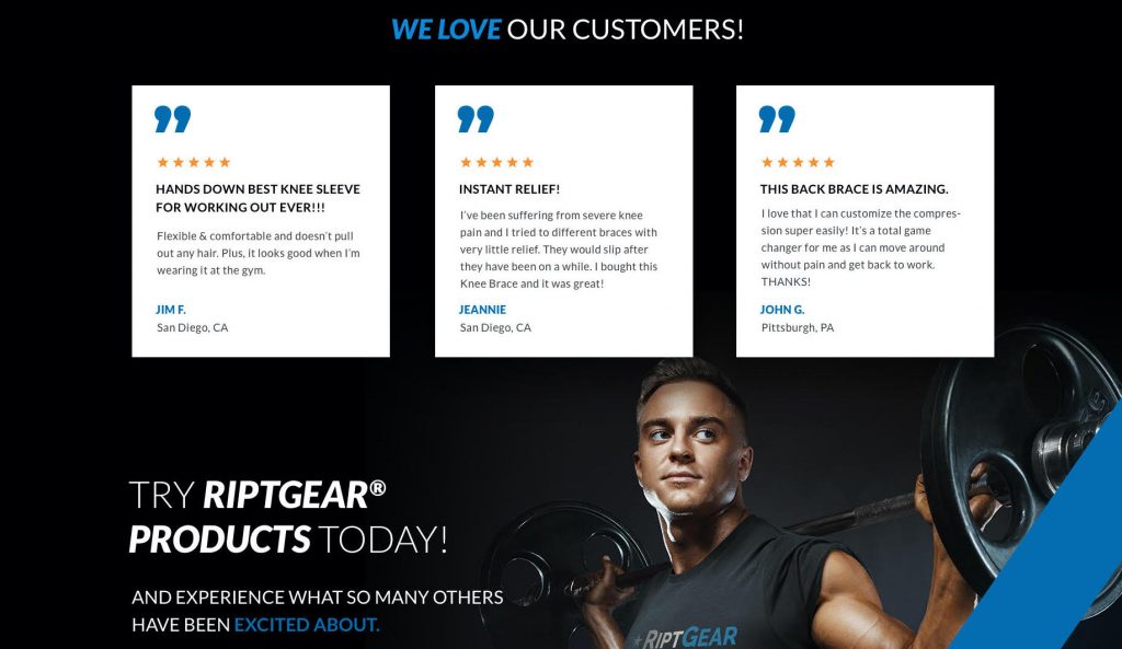
RiptGear lets their customers speak for them. (Image: RiptGear)
7. Show, don’t tell
With all the claims and promises brands tout online, people are becoming less and less likely to believe the hype. With that in mind, you can foster credibility and trust in your brand by leaving the bragging to others.
Landing pages are a great place to include quotes, statistics, and testimonials that showcase why your product or service is worth exploring. These elements serve as evidence that you’ll follow through on your claims.
8. Conduct A/B testing
The “set it and forget it” mindset? Couldn’t be us! Any experienced marketer will tell you that testing is a crucial part of running successful campaigns.
You can A/B test things like:
- Button colors
- CTAs
- Headlines
- Page layouts
- Visuals
And since landing pages have a clear goal, the data you gather from A/B testing should tell you a lot about what is and isn’t resonating with your audience.
The takeaway
The bad news: There’s no single trick that’ll make your conversions skyrocket.
The good news: By implementing these landing page design tactics, you can feel confident that yours are optimized, thorough, and created with your target audience’s needs in mind.

