These easy-to-implement tips and tricks will help you create landing pages that convert.
Here, you’ll find:
- Why landing pages are so crucial
- Key elements of effective landing pages
- Top strategies to increase landing page conversions
- Landing page tips and best practices from experts
A landing page can go by many names: static page, lead capture page, destination page — the list goes on.
No matter what you call them, landing pages are crucial to a well-rounded marketing strategy. They’re the destination on your website where people land after clicking an organic or paid promotion. They serve as a first impression and a starting point to lead the visitor down your sales funnel.
But when it comes to getting those visitors to convert, what should that message be — and how can you ensure you’re set up to maximize landing page conversions?
We’re glad you asked.
Keep these landing page tips in mind to boost landing page conversions and turn clicks into clients.
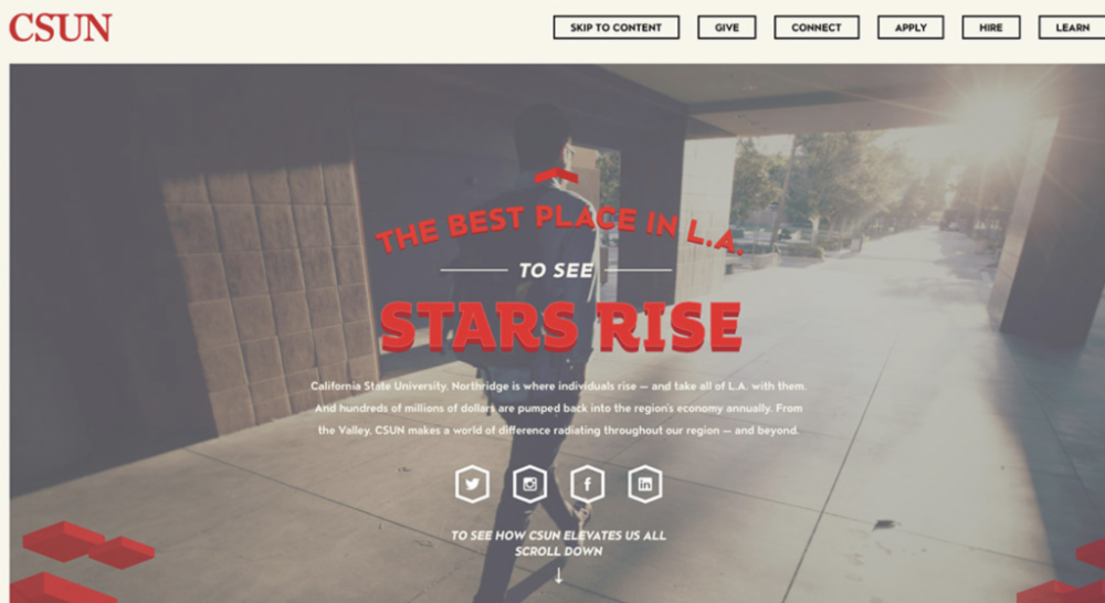
A landing page for CSUN
1. A killer headline
An effective, eye-catching headline can be the difference between someone bouncing from your landing page and actually completing the desired action, like filling out a form.
Crazy Egg highlights a few elements worth keeping in mind: such as clear prospect targeting, full transparency (aka no sensational promises you can’t actually keep), and emphasis on the benefit you’re offering.
Your headline can be a question that touches on a pain point (“Ready to say goodbye to toxic cleaning products?”), an enticing offer (“Grab one before it’s sold out”), or a solution to a common problem your audience faces (“Time to get organized — and in better sync with your team”).
No matter which avenue you choose, your headline is what reels people in and entices them to take the next step instead of closing the tab.
2. A strong call to action (CTA)
The point of a landing page is to start your visitor on a journey. That journey should include a CTA telling them the next desired action you want them to take.
Whether it’s completing a form, signing up for a newsletter, or requesting a consultation or demo, you want the CTA button to almost jump off the page, grab the viewer’s attention, and inspire them to click.
Pro tip: Rather than opting for the standard “click here” message, you can create customized button copy that’s cohesive with your landing page design to make the ask crystal clear. Bonus points if you A/B test various CTA buttons to see what your audience prefers.
3. A thoughtful design
Your landing page’s design should be intuitive as well as aligned to your website and overall branding.
You want to find a happy medium. Add too many elements on the page, and you risk your CTA getting lost in the shuffle. Add too few, and you risk underwhelming the user and having them bounce.
Your landing page design should also line up with your ad, both in verbiage and look (if applicable). These successful landing page examples illustrate how a good mix of imagery, graphics, and verbiage can create a strong landing page that accomplishes its goal.
4. A conversion rate optimization (CRO) strategy
A proper CRO strategy contains a few essential factors that can transform a regular ol’ landing page into one that’s fully optimized and ready to boost conversions.
These generally include:
- A headline
- Subheading that explains what the viewer can expect
- Concise and value-centric offer description
- An image
- A form
- Proof points that’ll drive your message home (more on those below).
As you continue to optimize, you can use CRO tools like heatmapping to track where your visitors are flocking. You can also A/B test various singular elements like photo choice and headline copy.
From there, review the data after a statistically significant amount of time so you can optimize accordingly.
You don’t want anything to get in the way of someone going to your landing page, filling out the form, and submitting it. So, it’s a good idea to remove unnecessary features on these pages — such as your main website navigation bar — even if they appear on your regular website.
The fewer distractions you offer, the higher your landing page conversions will likely be. Plus, you can always show a secondary CTA after they complete the form.
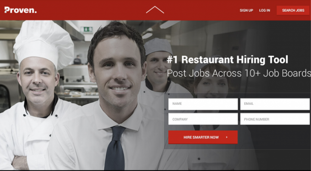
A landing page for Proven
5. An easy form
Speaking of forms, there’s a delicate balance to strike between asking for the information you need and not turning off the user by asking too much.
The less you ask for, the higher the conversion rate will likely be, and landing pages are where you’re most likely to gather this crucial data.
Ask for the minimum info you need to qualify a lead. You can conduct some testing to determine the best form for your business. Some CRM tools even offer smart forms that limit fields for returning visitors.
If you’re already tracking someone who has signed up for your newsletter or previously made a purchase, for example, you don’t need to ask for their email address again.
You may want to implement pop-up forms instead of having an embedded form on the page. These can be triggered after a set amount of time (like after 60 seconds on the page), once they scroll to a certain point (like halfway down the page), or by exit intent.
Pro tip: Seeing lots of drop-offs when it comes to your form? Try starting with a softball question (not literally — unless that’s your industry, of course). Starting off with a fun, easy-to-answer question can get visitors engaged in filling out the form and make them more likely to complete it.
6. A consistent, clear message
If the messaging in your ad is drastically different from your landing page, you risk confusing your user.
That’s why consistency in your messaging is key. Your ad verbiage should very closely mirror your landing page verbiage for a seamless experience. The copy should also be easily scannable, so someone skimming your content can still grasp the gist of what you’re offering.
You can also use the text on your landing pages to qualify your leads. More qualified leads will increase landing page conversions by targeting those most likely to buy.
This is frequently done by explaining who your product or service is for and who isn’t likely to benefit from it. Another good landing page tip for this is to know your ideal buyer persona well and use language that speaks to them in particular.
Make sure the text on your page flows together well and uses clear, engaging subheadings. Shorter is also better — landing page conversion rates for pages under 100 words often outperform pages over 500 words by 50%.
Pro tip: All of your landing pages should be SEO-friendly. Otherwise, you’re doing your hard work a disservice. Each page should have its own title, meta description, and URL.
7. Proof points
Sure, brands can talk about how great they are all day long. However, your competitors are vying for the same clicks you are — and trying to convince your audience that they’re the ones with the best solution.
Add some credibility for improved landing page conversions with proof points like badges or testimonials.
Are you partnered with a well-known brand in your industry? Do you have stellar quotes from satisfied clients? Use these to your advantage! This will help viewers see you as trustworthy and legitimate.
Pro tip: Reports show 63% of people prefer when a product they’re considering has both ratings and reviews they can look through.
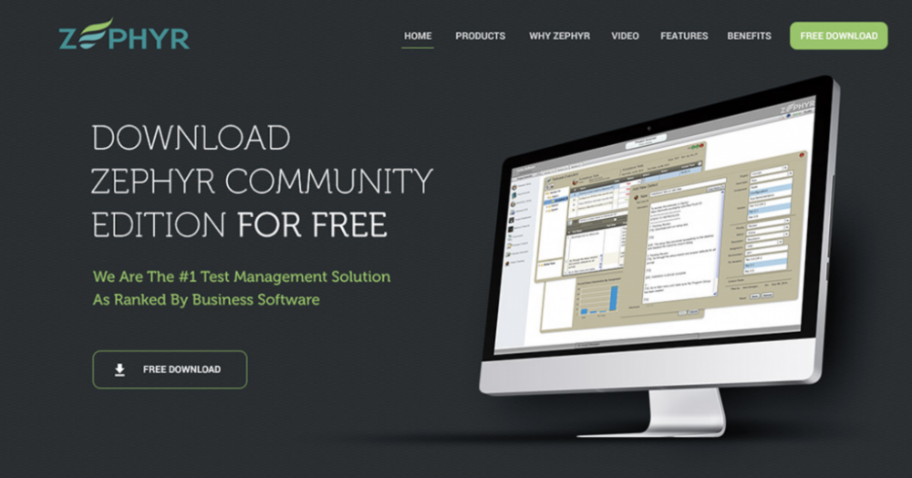
A landing page for Zephyr
8. A thorough plan
Once you have a goal for your landing page, the planning doesn’t stop there. You want to keep the conversation going.
One way to do that is to create a welcome campaign that automatically goes out to those who submit the form, introducing them to your business, offerings, and brand.
You can also use this as an opportunity to ask for feedback, thank them for making a purchase, or recommend other products or services they may like.
HubSpot puts the ROI for email campaigns at 4,200%, or $42 in return for every dollar spent. And when brands consistently include A/B testing in emails, that ROI can go up to $48 per $1 spent.
Need more help with your landing page strategy? Let’s talk.
9. A special offer
Not to blow your mind or anything, but limited-time offers are one of the most effective psychological marketing tactics around.
Who doesn’t love the feeling of getting a deal? If you promote a special discount, time-sensitive offer, or even a freebie, your conversion chances should go up.
Of course, this offer should make sense for your company, both fiscally and from a brand standpoint. Maybe you offer a 10% discount if someone schedules a consultation within a certain amount of time, or you waive the setup fee you usually charge.
10. Easy ways to share & connect
While we mentioned keeping landing pages minimal, social sharing buttons are a worthwhile addition. These make it easy for users to share your offer on social media (via social share buttons).
This way, you can instantly expand your reach into networks you may not have been able to access otherwise.
And if you’ve got an email forwarding option to boot, even better. People like to share in different ways, so the simpler you make it, the more you’ll see your message spread.
Pro tip: Make it easy for people to contact you for help or with questions. The more reachable you are (in as many ways as possible), the better your landing page conversions will be.
11. A mobile-friendly experience
One big part of effective marketing is meeting your potential customers where they are.
Often, that means on their phones.
That’s why it’s crucial to make your landing pages mobile-friendly.
But beware of mirroring desktop landing pages for a phone environment. The truth is, trying to fill out a form via your cell phone can be a nightmare. For mobile landing pages, it’s best to ask for as little information (at least in the first step) as you can.
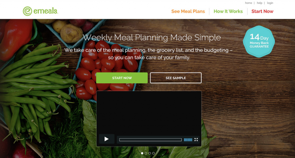
A landing page for eMeals
12. A consistent testing practice
Though the above tips can help you improve both landing page conversions and optimization, your audience may surprise you. That’s why you should continuously be testing your landing page elements like:
- CTA locations
- The number of form fields
- The type of validation (such as a quote, review, stars, or accolades)
- Colors
- Verbiage
The takeaway
There’s no crystal ball to tell you what will inspire a person to do exactly as your CTA says on your landing page.
But with these expert landing page tips, you can ensure that everything is well-optimized so you’re well on your way to increasing landing page conversions in no time.
This post has been updated and was originally published in September 2019.